 Vera Clarissa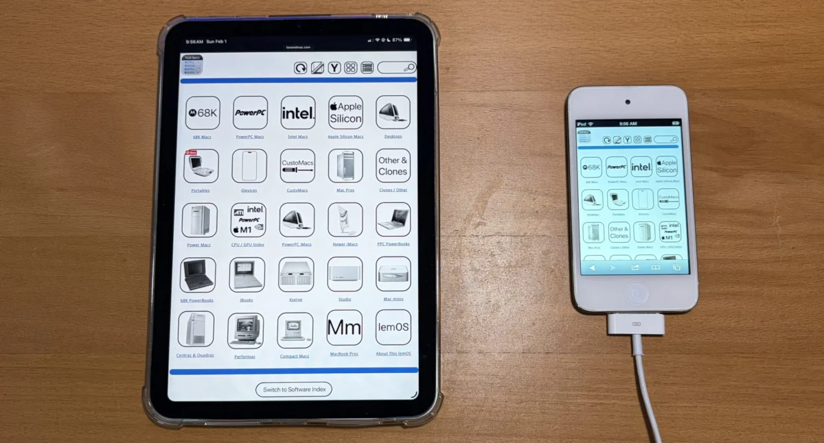
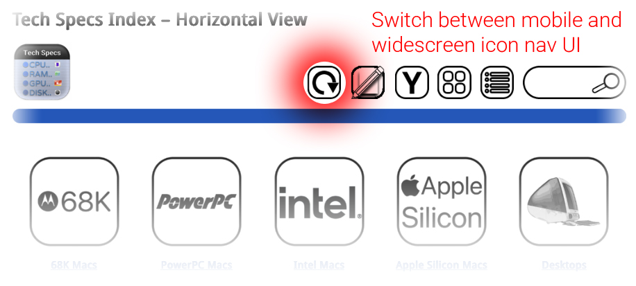
A significant and long-awaited enhancement to the Low End Mac website has finally been implemented, promising a more seamless and expansive browsing experience for its users. The project, which initially commenced in February, has now reached its first iteration, ensuring that nearly all navigation pages, including the primary navigation bar, technical specifications, and software index, can be fully displayed from edge to edge without the need for users to pinch-to-zoom. This development marks a substantial step forward in the website’s commitment to accessibility and user-friendliness, particularly for those accessing content on larger or wider displays.
The Evolution of the Low End Mac User Interface
The journey towards this comprehensive widescreen view began earlier this year with the intention of improving content presentation. Historically, Low End Mac, like many websites catering to a specific niche with a focus on older technology, has maintained a user interface that prioritizes compatibility and adaptability. The original, narrower icon view offered a distinct advantage: it was optimized for devices with narrower screens, providing a fallback mechanism should the site’s user interface require the temporary restoration of a sidebar. This design choice ensured that even on older or less capable devices, users could access the site’s wealth of information.
However, as digital consumption patterns have evolved and the prevalence of widescreen monitors and larger tablet displays has increased, the limitations of a predominantly narrow-screen optimized interface became more apparent. Users often found themselves needing to manually adjust their view or zoom in to read content fully, detracting from the overall user experience. The decision to implement a dedicated widescreen mode was a direct response to this evolving landscape and user feedback.
Introducing the Widescreen Viewing Mode
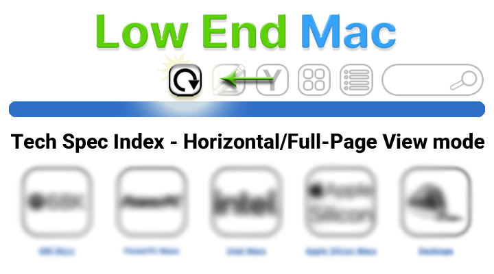
The newly introduced widescreen viewing mode, often referred to as horizontal view, fundamentally alters how content is presented. Upon activating this mode, the website’s layout expands to fill the available screen real estate. This means that elements previously confined to a narrower column now stretch across the display, offering a more immersive and information-rich presentation. Key areas of the website that benefit immediately from this overhaul include:
- Navigation Bar: The primary navigation elements are now more prominently displayed, allowing for quicker access to different sections of the site.
- Technical Specifications: Detailed specifications for a wide array of vintage Mac hardware, a cornerstone of Low End Mac’s content, can now be viewed in their entirety without horizontal scrolling or zooming. This is particularly beneficial for users researching specific models or comparing features across multiple devices.
- Software Index: The comprehensive index of software titles, often accompanied by extensive descriptions and download links, is now more easily digestible, presenting a broader overview of available applications.
- Article Layouts: The main body of articles, including text, images, and embedded media, are also adapted to the wider format, aiming to improve readability and reduce the cognitive load associated with navigating dense information.
Once a user switches to this new widescreen viewing mode, the UI is designed to remain in this configuration unless explicitly changed by the user through available options. This persistence ensures a consistent experience across multiple browsing sessions, allowing users to set their preferred view and maintain it. While not all pages have been fully integrated with this feature yet, the development team has indicated that full completion is expected by the end of the current week. This phased rollout allows for thorough testing and refinement before a complete site-wide implementation.
Technical Considerations and User Benefits
The implementation of a widescreen mode involves significant adjustments to the website’s cascading style sheets (CSS) and potentially its JavaScript framework. The goal is to create a responsive design that fluidly adapts to various screen dimensions while prioritizing content readability and visual appeal. The "bezel to shining bezel" description highlights the ambition to utilize the full width of modern displays, transforming the browsing experience from one of constant adjustment to one of effortless consumption.
The benefits for users are manifold:
- Improved Readability: Wider displays allow for longer lines of text, which, when appropriately set, can be more comfortable to read than very short or very long lines. The increased horizontal space accommodates more content at once, reducing the need for vertical scrolling.
- Enhanced Data Presentation: For pages featuring tables, charts, or extensive lists, the widescreen view offers a much clearer and more organized presentation. Users can see more data points simultaneously, facilitating quicker comprehension and comparison.
- Reduced Cognitive Load: By minimizing the need for zooming and panning, the widescreen mode reduces the mental effort required to navigate and absorb information. This is especially valuable for users who spend extended periods researching on the site.
- Accessibility for Larger Displays: Users with large monitors or those employing accessibility aids that enlarge screen elements will find the widescreen view particularly beneficial, ensuring that content remains fully visible and usable.
- Modernized User Experience: The implementation aligns the Low End Mac website with contemporary web design standards, offering a more polished and professional appearance that reflects the ongoing evolution of digital platforms.
Background Context: The Niche of Low End Mac
Low End Mac has established itself as a leading authority on older Apple Macintosh computers and related software. Founded in 1998, the site has built a loyal community by providing in-depth reviews, historical retrospectives, technical guides, and news pertaining to the vast spectrum of Mac hardware and software, often focusing on models that are no longer supported by Apple. In an era dominated by the latest technological releases, Low End Mac caters to a discerning audience that values the longevity, repairability, and unique user experience offered by vintage computing.
The website’s content is a treasure trove for collectors, enthusiasts, and those seeking to extend the lifespan of their existing Apple devices. This includes detailed information on everything from the original Macintosh to PowerPC-based Macs, early Intel Macs, and even the foundational iPods and iPhones. The demographic of Low End Mac’s readership likely includes a significant proportion of users who are adept with technology and appreciate the nuances of digital interfaces. Therefore, improvements that enhance the usability and accessibility of the site are met with significant anticipation.
The decision to invest in a UI overhaul, particularly one that enhances widescreen compatibility, speaks to the site’s commitment to its audience and its understanding of how users interact with digital content today. While the focus is on older technology, the platform itself is embracing modern web development practices to ensure its content remains accessible and engaging for generations to come.
Chronology of the Project
- February [Year]: Project initiation. The development of a more expansive viewing mode begins, with initial planning and architectural considerations.
- Subsequent Months: Development and testing phases. Work progresses on adapting existing page layouts and navigation elements to accommodate a wider display. Iterative testing is conducted to identify and resolve compatibility issues across various devices and browsers.
- Present: First iteration of the widescreen view is launched. Key navigation pages, including the navigation bar, tech specs, and software index, are now fully optimized for widescreen display.
- End of Current Week: Full site-wide implementation of the widescreen view is projected to be completed. All remaining pages and content areas are expected to be integrated into the new viewing mode.
This phased approach, starting with critical sections of the site and moving towards full implementation, is a common and effective strategy in web development. It allows for early feedback and refinement, ensuring a more robust final product.
Supporting Data and Analogous Developments
The shift towards widescreen optimization is not unique to Low End Mac. Across the digital landscape, websites have been adapting their layouts to better suit the proliferation of larger screens. According to various web analytics reports, the average screen resolution has steadily increased over the past decade. For instance, data from sources like StatCounter Global Stats consistently show a significant and growing percentage of internet traffic originating from devices with screen widths exceeding 1024 pixels, with many common resolutions falling into the 1366×768, 1920×1080, and even higher categories.
This trend has led to a broader adoption of responsive web design principles, where layouts fluidly adjust based on screen size. While Low End Mac’s implementation is a specific feature enhancement rather than a complete responsive redesign, it addresses a similar user need: to present content effectively on larger displays. The success of this initiative can be benchmarked against similar website improvements in niche communities that have prioritized user experience by adapting to evolving display technologies.
Potential Implications and Future Outlook
The successful implementation of the widescreen view has several positive implications for Low End Mac and its community. Firstly, it enhances the overall user experience, making the site more enjoyable and efficient to navigate. This can lead to increased user engagement, longer session durations, and a higher likelihood of return visits.
Secondly, by presenting complex technical data and extensive software listings in a more digestible format, the site becomes an even more valuable resource for users engaged in detailed research or comparative analysis. This can further solidify Low End Mac’s position as a primary destination for information on vintage Apple technology.
Looking ahead, the completion of this project is likely to pave the way for further UI/UX enhancements. The experience gained from developing and implementing the widescreen mode can be leveraged for future improvements, potentially including more interactive elements, enhanced search functionalities, or even a more sophisticated content management system. The commitment to modernizing the user interface, even for a site dedicated to older technology, demonstrates a forward-thinking approach that ensures its continued relevance and accessibility. The site’s ability to adapt and evolve in its presentation, while maintaining its core mission of preserving and sharing knowledge about vintage Apple computing, will be key to its long-term success.