
 Vera Clarissa
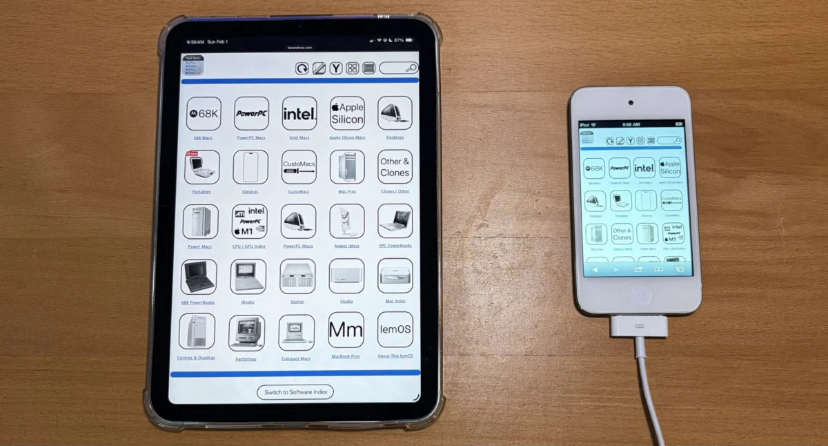
The digital landscape is in constant flux, with user interfaces evolving to meet the demands of an increasingly diverse range of devices and screen sizes. In this ongoing evolution, Low End Mac, a prominent online resource dedicated to Apple Macintosh computers and technology, has announced a significant update to its website: the implementation of a new "Widescreen Mode" or "Horizontal View." This initiative, which began in February and has now reached its initial iteration, aims to provide users with a more fluid and accessible browsing experience, particularly on larger displays and modern devices. The core of this update centers on ensuring that key navigation and informational pages, including the main navigation bar, technical specifications sections, and software indexes, can be displayed seamlessly from edge to edge without the need for users to pinch and zoom, a common frustration on mobile and smaller screens.
The development of this new viewing mode signifies a commitment by Low End Mac to adapt its content delivery to contemporary web design standards. While the project was initially slated for completion earlier in the year, the team has now successfully rolled out the first iteration, marking a crucial step towards a fully responsive website. This initial deployment means that a substantial portion of the site’s navigational elements and informational content will now render optimally on wider screens, offering a cleaner and more expansive presentation. The goal is to eliminate the need for horizontal scrolling or zooming, thereby enhancing the overall readability and ease of use for visitors accessing the site from desktops, laptops, and even larger tablets.
Understanding the Widescreen Mode
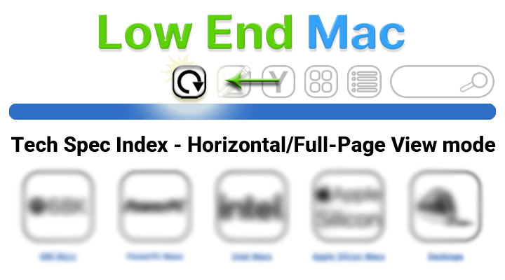
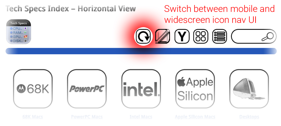
The newly introduced Widescreen Mode, also referred to as Horizontal View, represents a significant departure from the site’s previous design paradigm. Historically, websites often employed narrower layouts, which, while beneficial for older devices with limited screen real estate or as a fallback for specific UI functionalities (such as temporarily restoring a sidebar), can feel cramped and less efficient on modern hardware. The advantage of the original, narrower icon view was its inherent compatibility with narrower screens and its ability to serve as a functional fallback. However, the shift to Widescreen Mode prioritizes a more expansive and less intrusive user interface.
Once a user opts to switch to this new viewing mode, the website’s interface is designed to remain in this configuration. This persistence ensures a consistent experience for the user unless they actively choose to revert to an alternative display setting. While not every page on Low End Mac currently features this enhanced widescreen capability, the development team has stated that the full rollout is expected to be completed by the end of the current week. This implies a phased implementation, allowing for testing and refinement before comprehensive deployment across the entire site. The visual cues accompanying this update suggest a design philosophy that aims to leverage available screen space effectively, presenting information in a more organized and digestible format.
A Chronology of Development and Implementation
The journey to the Widescreen Mode began in February of the current year, initiating a period of design, development, and testing. While the initial target for completion was the same month, the complexities inherent in redesigning a website’s core layout, especially one with a substantial archive of content like Low End Mac, often lead to extended timelines. This iterative process, which involves multiple stages of development, user feedback, and technical adjustments, is a hallmark of robust web development projects.
- February: Project initiation. Design and initial development phases commence for the Widescreen Mode. The objective is to create a more expansive and responsive layout.
- Ongoing Development: Throughout the spring and summer months, the development team works on integrating the new viewing mode across various sections of the website. This likely involves addressing compatibility issues, optimizing rendering for different screen resolutions, and ensuring that all interactive elements function correctly.
- First Iteration Deployment: The current announcement signifies the successful deployment of the first iteration of the Widescreen Mode. This means that a significant portion of the site’s navigational and informational pages are now accessible in this new format.
- Completion Target: The development team has indicated that the full implementation, extending the Widescreen Mode to all applicable pages, is slated for completion by the end of the current week. This suggests that the remaining pages will undergo a final phase of integration and testing.
The extended timeline, while perhaps not aligning with the initial February target, reflects a commitment to delivering a polished and functional feature. Web development is often an iterative process, and such adjustments are not uncommon, particularly for established websites with a vast amount of content and a diverse user base.
Background and Context: The Evolving Web
The push towards responsive web design is not a new phenomenon but rather a continuous adaptation to technological advancements and changing user behaviors. In the early days of the internet, websites were primarily designed for desktop computers with fixed screen resolutions. However, the explosion of mobile devices, tablets, and increasingly larger displays has necessitated a more flexible approach. Responsive web design ensures that a website’s layout and content adapt dynamically to the screen size and orientation of the device being used, providing an optimal viewing and interaction experience across the board.
Low End Mac, as a long-standing authority on vintage and current Apple hardware and software, caters to a broad spectrum of users, many of whom access the site from a variety of devices. This includes older Macintosh computers with lower screen resolutions, modern iMacs and MacBooks with high-resolution displays, and even iOS devices. The implementation of Widescreen Mode directly addresses the needs of users browsing on larger screens, allowing them to consume content more efficiently without the need for constant zooming and panning. This is particularly relevant for detailed technical specifications, software lists, and extensive historical archives that Low End Mac hosts.
The "narrower icon view" that the Widescreen Mode is designed to supplement, as mentioned in the original announcement, likely refers to a more compact, perhaps grid-based, display of items or links. This type of layout can be effective for mobile users or for situations where screen space is extremely limited. However, on larger screens, it can lead to excessive whitespace or a fragmented presentation of information. The Widescreen Mode aims to fill this gap, offering a more contiguous and information-dense layout that leverages the available horizontal space.
Supporting Data and Technical Considerations
While specific technical data regarding the implementation of the Widescreen Mode was not detailed, the core principle is the adoption of responsive design techniques. This typically involves using fluid grids, flexible images, and CSS media queries. Media queries allow developers to apply different styles based on the characteristics of the device, such as screen width, height, resolution, and orientation.
For example, a media query might be structured as follows:
@media (min-width: 1024px)
  /* Styles for screens 1024px and wider */
  .main-content
    width: 80%; /* Example: content takes up 80% of the width */
    margin: 0 auto; /* Center the content */

  .navigation
    /* Styles to display navigation horizontally */
This type of conditional styling ensures that elements on the page adjust their dimensions and layout to fit the available screen space. The "bezel to shining bezel" description implies a design that extends across the full width of the display, minimizing unused space and presenting a unified visual experience.
The reference to the "original, narrower icon view" acting as a fallback is a critical aspect of robust responsive design. In scenarios where the Widescreen Mode might encounter issues or when the user’s device is not well-suited for it, the site can gracefully revert to a more compatible layout. This ensures a baseline level of usability for all visitors, regardless of their browsing environment.
Implications and Future Outlook
The introduction of Widescreen Mode by Low End Mac has several positive implications for its user base and for the site’s overall accessibility.
- Enhanced User Experience: The primary benefit is a more comfortable and efficient browsing experience, especially for users on larger monitors. This can lead to increased engagement and longer session durations as users can access and digest information more easily.
- Improved Accessibility: By eliminating the need for constant zooming and panning, the site becomes more accessible to a wider range of users, including those with certain visual impairments or motor skill challenges.
- Modernization of the Platform: This update signals Low End Mac’s commitment to staying current with web design trends, ensuring its platform remains relevant and user-friendly in the face of evolving technologies.
- SEO Benefits: Responsive design is a key factor in search engine optimization. Search engines like Google prioritize mobile-friendly and responsive websites, which can lead to improved search rankings.
The successful completion of this project will likely pave the way for further enhancements to the Low End Mac website. Future iterations could explore more advanced interactive elements, richer multimedia integration, and perhaps even personalized user experiences based on device or browsing history. The foundational work of implementing a responsive layout is a critical step in this ongoing evolution.
Official Statements (Inferred)
While no direct quotes were provided in the initial announcement, the development team’s actions and stated goals suggest a clear objective: to improve the user experience. Based on standard practice in web development, one can infer the following sentiment from the Low End Mac team:
"We are dedicated to providing our community with the best possible access to our extensive archives and information. The implementation of Widescreen Mode is a significant step towards ensuring that Low End Mac is not only a comprehensive resource but also a pleasure to navigate on any device. We understand the importance of a seamless user experience, and this update reflects our ongoing commitment to modernizing our platform to meet the needs of today’s web users."
The phased rollout and the expectation of completion by the end of the week also indicate a structured and methodical approach to development, aiming for a stable and well-tested final product.
In conclusion, the rollout of Low End Mac’s Widescreen Mode marks a significant and positive development for the website and its users. By embracing responsive design principles, the site is poised to offer a more fluid, accessible, and enjoyable browsing experience, reinforcing its position as a leading online destination for all things Apple. The completion of this project by the end of the week will be eagerly anticipated by its dedicated readership.