 Vera Clarissa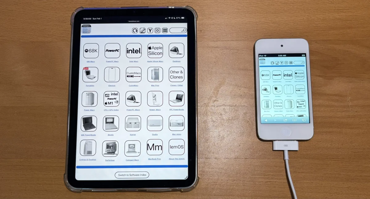
The ongoing efforts to modernize the user interface of Low End Mac, a prominent website dedicated to vintage and specialized Apple computing, have culminated in the successful deployment of its first iteration of a new widescreen viewing mode. This significant update, initially conceptualized in February, aims to provide a more seamless and visually accessible experience for users navigating the site’s extensive archives and technical specifications, particularly on larger displays. The core functionality of this enhancement allows nearly all navigation pages, including the main navigation bar, detailed tech specs, and software indexes, to be fully displayed without the need for users to zoom or pan across their screens.
Genesis of the Widescreen Initiative
The project to introduce a widescreen viewing mode was driven by a growing recognition of evolving user browsing habits and the increasing prevalence of high-resolution displays. While the previous interface, characterized by a narrower, icon-centric layout, offered advantages for devices with limited screen real estate and served as a functional fallback, it presented challenges for users on desktop monitors and larger tablets. The goal of the widescreen mode is to leverage the available horizontal space, presenting information in a more expansive and less cramped manner. This redesign signifies a proactive approach by the Low End Mac team to adapt its platform to contemporary web standards and user expectations.
The development process, which commenced in February, involved several phases of planning, design, and implementation. Challenges encountered during this period, while not explicitly detailed, likely included the intricate task of reformatting a vast and diverse array of existing content to fit the new layout. The successful completion of the first iteration marks a significant milestone, indicating that the foundational architecture for the widescreen experience is now in place. Future development will focus on extending this functionality to the entirety of the website’s content.
Understanding the Widescreen and Original View Modes
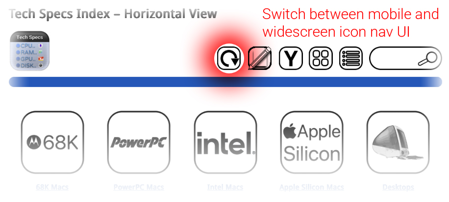
The newly implemented widescreen mode, often referred to as "Horizontal View," is designed to maximize the use of available screen width. This contrasts with the original, narrower icon view, which remains a viable option and serves specific purposes. The narrower view is optimized for devices with smaller screens, ensuring legibility and ease of use on smartphones and older tablets. Furthermore, it acts as a crucial fallback mechanism. In instances where site elements might require temporary restoration of a sidebar or other layout components, the narrower view provides a stable and functional alternative.
Users can actively switch to the widescreen viewing mode, and this preference is designed to be persistent. Once selected, the UI will retain this widescreen configuration until the user chooses to revert to the original view or selects another display option. This persistent setting aims to provide a consistent user experience, allowing individuals to curate their browsing environment according to their device and personal preference.
While the initial rollout has successfully integrated widescreen viewing for a substantial portion of the site’s navigation pages, the development team has indicated that the feature is not yet universally applied. The current phase represents the first iteration, with a clear roadmap for full implementation. The stated objective is to achieve complete coverage of all pages with the widescreen viewing capability by the end of the current week. This aggressive timeline suggests a focused effort to finalize the integration and address any remaining content elements.
Technical Considerations and User Experience Enhancements
The technical underpinnings of this redesign likely involve responsive web design principles, employing CSS media queries and flexible grid systems to adapt content presentation across various screen sizes. The objective is to ensure that elements scale appropriately, maintaining readability and visual appeal from the smallest mobile devices to the largest desktop monitors. This approach avoids the need for users to constantly pinch-to-zoom, a common frustration on mobile devices when websites are not optimized for smaller screens.
The decision to prioritize navigation pages in this initial phase is strategically sound. These are the gateway to the website’s vast repository of information, and ensuring their accessibility and ease of use is paramount to the overall user experience. By making the core navigation structures readily viewable, users can more efficiently explore the site’s extensive archives of vintage Mac reviews, technical specifications, software databases, and historical articles.
The visual examples provided, depicting how the UI can be envisioned to be easier to use across multiple sizes of devices, underscore the commitment to a user-centric design philosophy. These mockups or examples likely illustrate a clean, organized layout where information is presented in digestible chunks, with ample white space and clear typography. The goal is to reduce cognitive load and enhance the speed at which users can find the information they are seeking.
Background: The Enduring Value of Low End Mac
Low End Mac has long served as a vital resource for a dedicated community of Apple enthusiasts, collectors, and users of older Macintosh hardware. Founded by Adam Robertson, the site has meticulously documented the evolution of Apple’s product lines, offering in-depth reviews, technical specifications, historical context, and advice on maintaining and utilizing vintage Macs. In an era where technology obsolescence is rapid, Low End Mac champions the longevity and continued relevance of these machines, fostering a sense of appreciation for Apple’s design and engineering heritage.
The website’s comprehensive archives cover decades of Macintosh history, from the earliest Macintosh models to more recent, yet still considered "low-end" or specialized, machines. This includes a wealth of information on specific hardware configurations, software compatibility, upgrade paths, and troubleshooting tips. The community surrounding Low End Mac often comprises individuals who appreciate the unique user experience offered by classic macOS versions, the tactile feel of older keyboards, and the distinct aesthetic of vintage Apple designs.
The introduction of a more accessible and modern interface is not merely an aesthetic upgrade; it is an enhancement of the site’s core mission. By making its wealth of information more readily available and easier to consume, Low End Mac is reinforcing its position as the premier online destination for all things related to vintage Apple computing. This modernization effort ensures that its valuable content remains accessible to a wider audience, including newer generations of tech enthusiasts who may be discovering the appeal of older Apple hardware.
Broader Implications for Digital Archives and Niche Websites
The redesign undertaken by Low End Mac has implications that extend beyond its immediate user base. In an increasingly digital world, the preservation and accessibility of historical information are critical. Websites like Low End Mac act as digital archives, safeguarding the history of technology and culture. The challenges they face in maintaining and updating their platforms are common to many niche websites that are often run by passionate individuals or small teams with limited resources.
The success of this widescreen implementation demonstrates that even established, content-rich websites can adapt to modern web standards without compromising their core identity or alienating their existing audience. It highlights the importance of investing in user experience as a means of ensuring the long-term viability and impact of digital archives.
For other niche websites dealing with historical or specialized content, the Low End Mac initiative can serve as a case study. It underscores the potential benefits of embracing responsive design and user-centric interfaces to reach new audiences and enhance engagement with existing ones. The fact that the project is being rolled out iteratively, with a clear commitment to full completion, suggests a pragmatic and sustainable approach to development.
Future Outlook and Community Reception
The full rollout of the widescreen viewing mode is anticipated to significantly enhance the browsing experience for users on a wide array of devices. This will likely lead to increased time spent on the site, deeper exploration of its archives, and a more positive overall impression of Low End Mac as a modern and user-friendly resource.
While official statements from the Low End Mac team are limited to the provided information, the proactive nature of this development suggests a strong commitment to the site’s evolution. The community, known for its dedication and engagement, is likely to respond positively to these improvements. The ability to access detailed technical specifications and historical articles without the frustration of zooming or panning will undoubtedly be welcomed by long-time readers and new visitors alike.
The successful completion of this project will solidify Low End Mac’s position as not only a repository of vintage Apple knowledge but also as a well-maintained and forward-thinking digital platform. The ongoing development signals a bright future for the site, ensuring its continued relevance and accessibility for years to come.