 Chalid Lutfie
The conclusion of the SOUNDSHOCK series, a prominent venture into the preservation and celebration of FM synthesis music, marks not only the end of a musical trilogy but the culmination of a distinct visual narrative. Central to this project’s identity was the contribution of Japanese manga artist and illustrator Tsuyoshi Shimokura, whose hand-painted album covers provided a surreal, technical, and deeply symbolic visual language for the series. Orchestrated by the project lead known as zinger, the collaboration between the electronic music community and traditional Japanese illustration highlights a unique intersection between digital audio culture and analog fine art.
The Origins of a Creative Partnership
The collaboration began during the development of the first installment, FM FUNK MADDNESS!!. Initially, zinger contacted Shimokura through community member hex125, primarily seeking a musical contribution. Upon reviewing Shimokura’s portfolio, zinger discovered a repository of complex, high-detail illustrations that reflected a profound appreciation for computer hardware and legacy game aesthetics. This discovery shifted the nature of the partnership; Shimokura was subsequently commissioned to define the visual identity of the entire SOUNDSHOCK project.
This partnership was predicated on a shared technical enthusiasm. Both parties possessed a deep-seated interest in FM (Frequency Modulation) synthesis—a sound synthesis method that dominated the gaming landscape in the 1980s and 1990s through iconic chips such as the Yamaha YM series. By blending the raw, mathematical precision of FM sound with Shimokura’s organic, hand-painted aesthetic, the SOUNDSHOCK series aimed to create a holistic experience that bridged the gap between retro-computing nostalgia and contemporary artistic expression.
Chronology of the SOUNDSHOCK Visual Identity
The visual trajectory of the series followed a deliberate progression, mirroring the escalating complexity of the compositions within the albums.
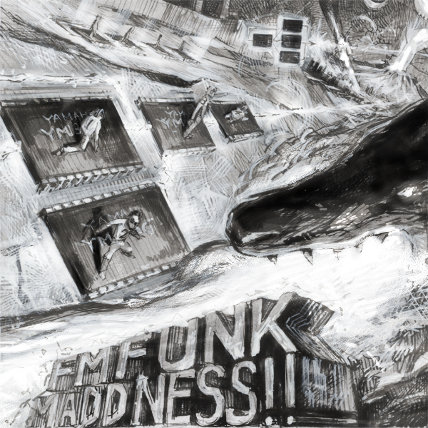
- 2014-2015: The MADDNESS Era: The inaugural album, FM FUNK MADDNESS!!, established the series’ visual blueprint. Drawing inspiration from 1980s and 90s arcade flyers—specifically the aesthetics found in Metal Black and Darius II—the cover art utilized a heroic, high-energy motif. Shimokura’s sketches depicted a narrative where musicians utilized the power of FM synthesis as a weapon to "save the world." Technically, the art featured FM chip architectures visualized as caterpillars and algorithm charts, grounding the surreal imagery in the actual hardware that defined the genre.
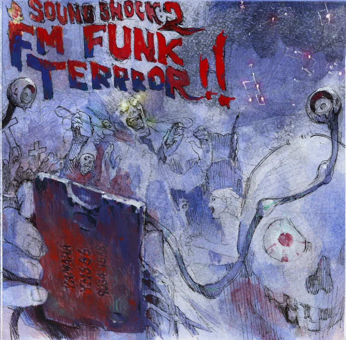
- 2015-2016: The TERRROR Expansion: The second installment, FM FUNK TERRROR!!, marked a tonal shift toward the grotesque and the macabre. Influenced by 1980s horror cinema and cult video game franchises like Splatterhouse, the artwork integrated a narrative of "FM zombies." These creatures, adorned with hardware-themed grave markers, represented the obsessive nature of the FM sound community. This phase saw a deeper collaborative process, with months of conceptual exchanges involving horror posters and experimental sketches, resulting in a dense, symbolic collage that mirrored the album’s intense sonic texture.
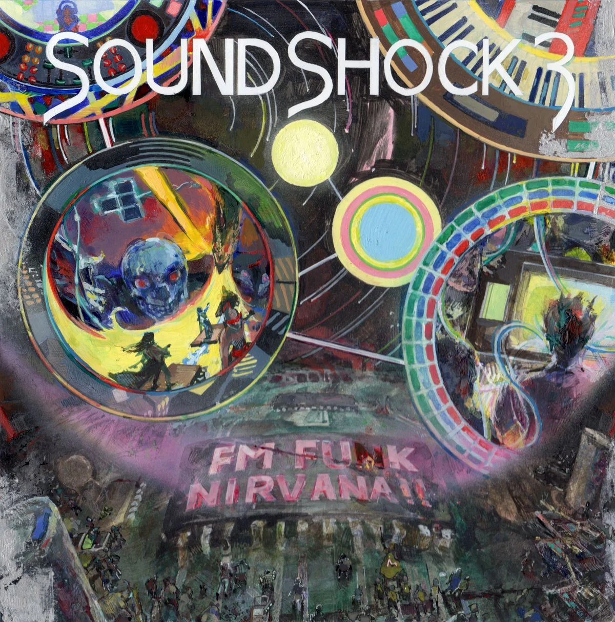
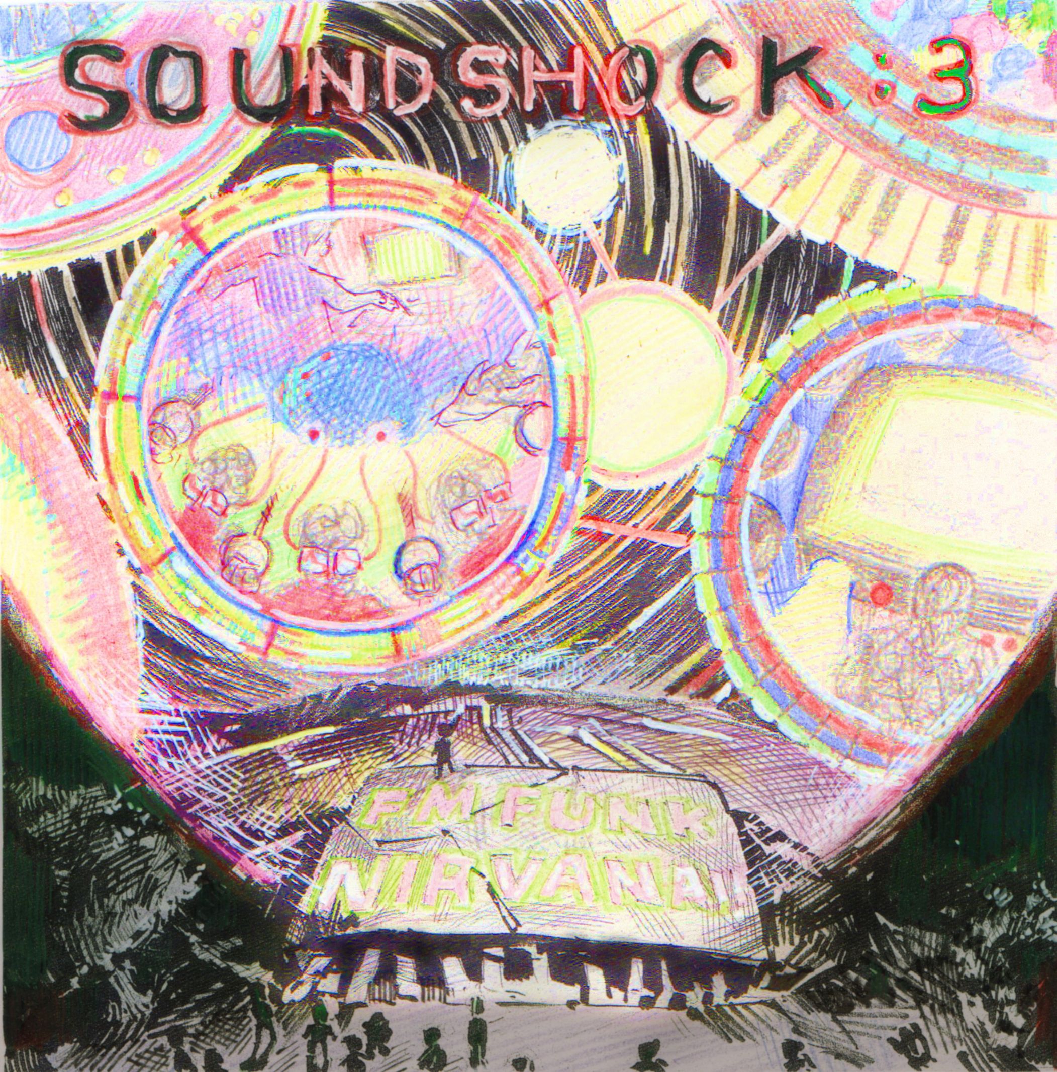
- 2016-2017: The NIRVANA Conclusion: The final volume, FM FUNK NIRVANA!!, represented the project’s intellectual peak. The title was derived from community feedback—a fan suggestion that pushed the naming convention toward a state of "perfection." Shimokura’s cover art for this installment moved away from the kinetic energy of the previous two, opting for a meditative, mandalic composition. The artwork featured a massive, centralized FM chip acting as a religious icon, surrounded by spheres containing disparate elements of the universe. This final piece served as a visual synthesis of the series’ overarching philosophy: the elevation of FM sound from mere utility to a form of digital spirituality.
Symbolic Analysis and Philosophical Underpinnings
The artwork for the NIRVANA volume is particularly significant for its reliance on religious iconography. The mandala-like arrangement of the spheres serves to focus the viewer’s attention, effectively acting as a "spiritual guidance tool," a function traditionally attributed to mandalas in various eastern spiritual traditions.
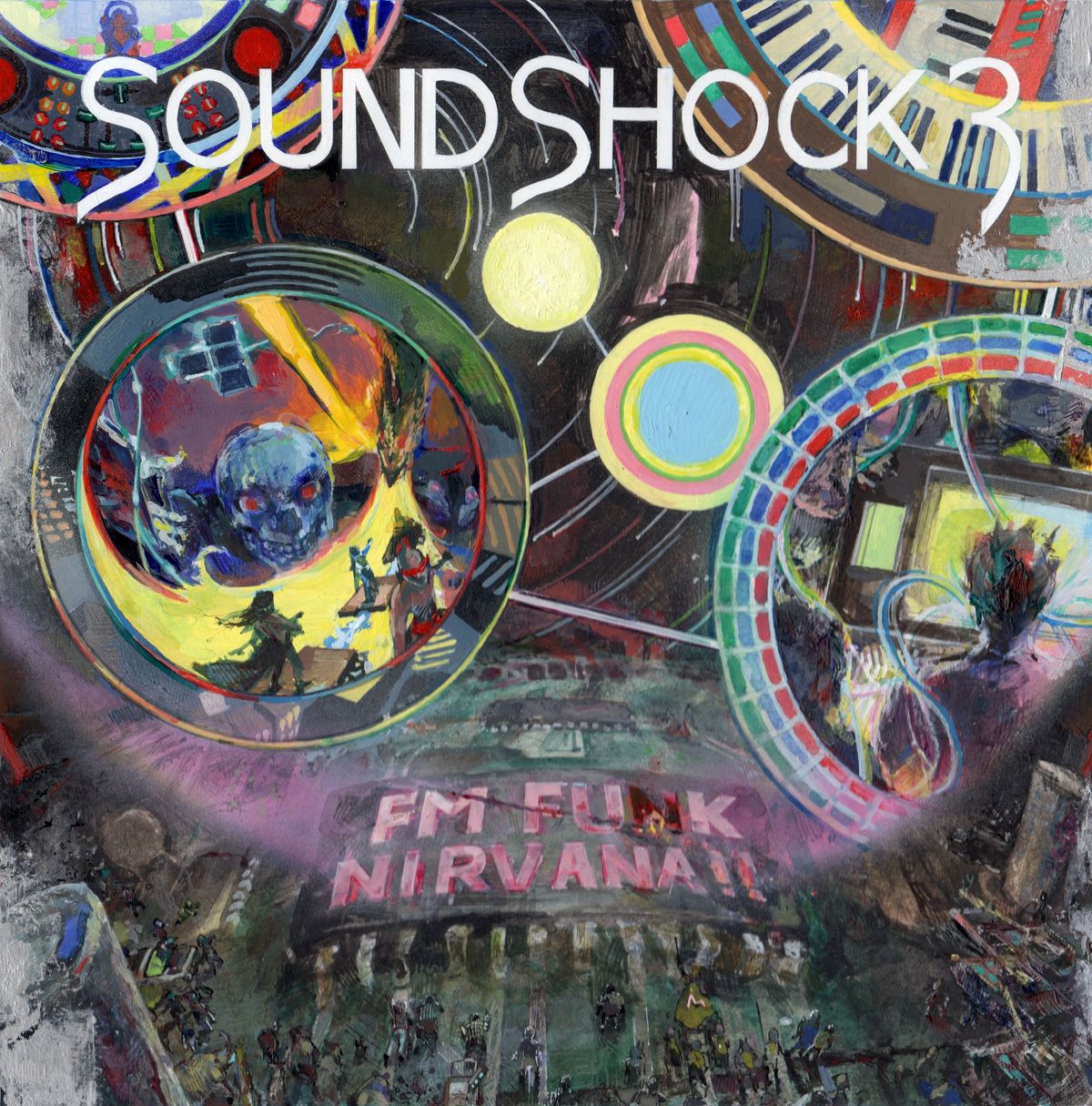
By positioning a circuit board as an object of worship, Shimokura and zinger presented a commentary on the nature of fandom and the longevity of technological artifacts. The "FM disciples" depicted at the base of the artwork suggest that the SOUNDSHOCK series was never intended to be a closed loop. As Shimokura noted in his concluding message, the series serves as a "seed for future stars." This philosophy treats the FM sound not as a relic of the past, but as a foundational element for future artistic progeny. The "spiritual offshoots" referenced by the artist imply that the project’s true success lies in its ability to inspire a new generation of composers and artists to iterate upon the foundations laid by the pioneers of the 80s.
Technical Synthesis and Artistic Process
The production process behind these covers was rooted in traditional techniques, a rarity in a digital-first medium. Shimokura provided multiple layers of conceptual sketches, rough drafts, and written narratives to explain the intended "lore" of each cover. This level of dedication ensured that the visuals were not merely decorative but were inextricably linked to the sonic output.
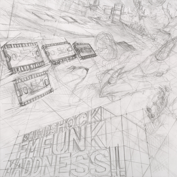
For MADDNESS!!, the focus was on the physical movement of components—the "caterpillar-like" motion of the chips was a direct allusion to the fluidity of FM sound. For TERRROR!!, the integration of 80s horror tropes served to highlight the "shock" aspect of the series’ name, translating the visceral, abrasive nature of early electronic synthesis into visual forms of horror. These details were not accidental; they were the product of a collaborative dialogue that lasted for years, allowing the visual identity to evolve organically alongside the musical selection.
Broader Impact and Implications
The SOUNDSHOCK series stands as a case study in the intersection of subcultural music scenes and visual art. By commissioning a professional artist with a background in manga to create original, physical-media-focused artwork, the project elevated itself above standard digital releases. This approach had several tangible implications:
- Cultural Preservation: The project served to document the nuances of FM synthesis, a field that is often overlooked in mainstream electronic music history.
- Community Engagement: By incorporating community suggestions into the titling and conceptualization of the artwork, the project created a feedback loop that fostered a highly dedicated audience.
- Visual Literacy: The use of sophisticated, symbolic imagery encouraged the listener to engage with the albums on a semiotic level, moving beyond passive consumption to active interpretation.
As the series concludes, the legacy of this collaboration remains a testament to the power of cross-disciplinary creative projects. Tsuyoshi Shimokura’s artwork did not merely decorate the music; it provided a context that allowed the listener to see the FM chip as a cultural artifact of profound significance. The "stilted" but deeply resonant message provided by Shimokura regarding the end of the series underscores a core tenet of modern artistic output: that the termination of a project is not a cessation of influence, but rather the dispersal of ideas into a wider cultural sphere.
Ultimately, the SOUNDSHOCK series succeeded because it respected the intelligence of its audience, treating the listener as a participant in a larger, ongoing conversation about the role of technology in human creativity. Whether through the frantic energy of MADDNESS!! or the meditative stillness of NIRVANA!!, the visual narrative established by Shimokura ensures that the series will be remembered not just for the sounds it preserved, but for the depth of the world it constructed around them.