 Vera Clarissa
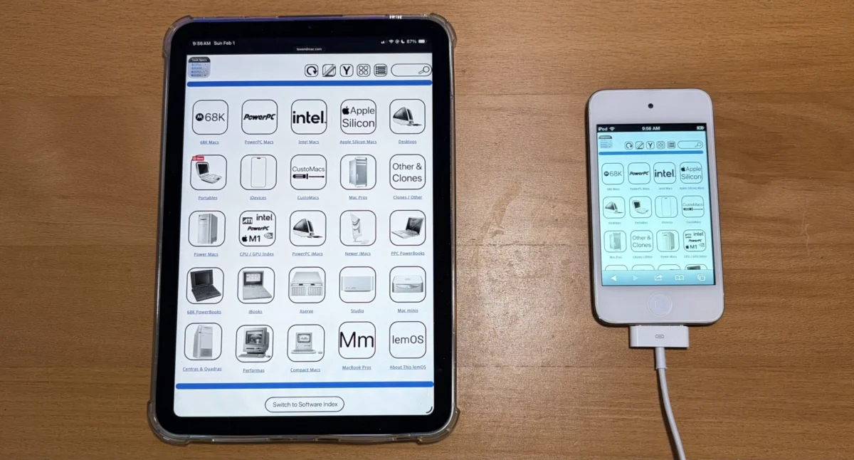
The digital landscape of technology enthusiast websites is constantly evolving, driven by a commitment to providing users with accessible and comprehensive information. In this vein, Low End Mac, a long-standing resource for vintage and budget-friendly Apple hardware and software, has announced the successful first iteration of its new "Horizontal View" or "Widescreen Mode." This significant update, which began development in February, aims to revolutionize how users interact with the site’s extensive content, particularly its detailed technical specifications and software indexes. The primary objective is to eliminate the need for pinching and zooming on modern devices, ensuring a seamless browsing experience from edge to edge.
A New Horizon for Navigation and Information Access
The newly implemented Widescreen Mode represents a substantial leap forward in user interface design for Low End Mac. Previously, the website predominantly utilized a narrower icon-based view, which, while functional, presented challenges on the increasingly prevalent larger displays and high-resolution screens of contemporary smartphones, tablets, and desktop monitors. This traditional layout often necessitated users to manually adjust their screen magnification to view full content, disrupting the flow of information and potentially diminishing user engagement.
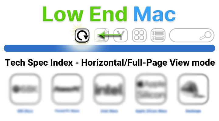
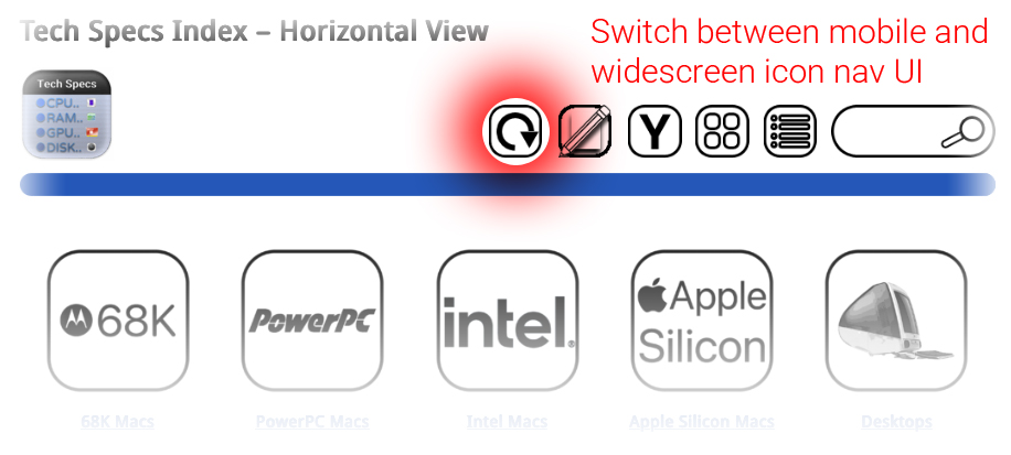
The core of this enhancement lies in its ability to present nearly all navigation pages, including the main navigation bar, detailed technical specifications, and the comprehensive software index, in a horizontally expanded format. This means that once a user opts for the Widescreen Mode, the site’s layout will adapt to occupy the full width of their screen, displaying information in a more natural and less constrained manner. This is particularly beneficial for pages laden with detailed charts, lengthy lists, or intricate technical data, where horizontal real estate is crucial for clarity and readability.
Origins and Development Timeline: A Deliberate Evolution
The project’s genesis can be traced back to February of this year, with initial intentions to complete the first iteration by the end of that month. However, as with many ambitious web development projects, the scope and technical considerations likely led to a more extended development cycle. The successful deployment of the first iteration now marks a significant milestone, signifying that the foundational elements of this new viewing mode are in place and operational.
The development process would have involved meticulous planning, design, and coding. Key considerations would have included:
- Responsive Design Principles: Ensuring the new mode adapts gracefully across a wide spectrum of screen sizes and resolutions.
- Content Reformatting: Adjusting the layout and presentation of existing content, particularly tables and complex data, to fit the wider format without compromising readability.
- User Interface (UI) Elements: Designing new controls or modifying existing ones to allow users to easily toggle between the traditional and Widescreen modes. The mention of "options above" suggests a user-selectable control, likely a button or toggle switch.
- Performance Optimization: Ensuring that the new mode does not negatively impact page load times or overall website performance, which is critical for user retention.
- Accessibility: Considering users with visual impairments or those who rely on assistive technologies, ensuring the new mode enhances rather than hinders their experience.
While the first iteration is now live, the Low End Mac team has indicated that the implementation will be progressively rolled out. The current state is that "mostly every navigation page" benefits from this feature, with a commitment to completing the rollout across all relevant pages by the end of the current week. This phased approach allows for thorough testing and refinement before a full public release.
Understanding the Dual-Mode Functionality
The introduction of Widescreen Mode does not signify the obsolescence of the original, narrower icon view. Instead, Low End Mac has strategically retained this format for specific advantages. The original view’s narrower aspect ratio is inherently more suited for devices with smaller, more constrained screens, such as older smartphones or specific tablet configurations. Furthermore, it serves as a crucial fallback mechanism. In scenarios where the site’s user interface might temporarily require the restoration of a sidebar or other elements that conflict with the widescreen layout, the narrower view can be gracefully re-engaged.
This dual-mode functionality demonstrates a thoughtful approach to user experience, acknowledging that a one-size-fits-all solution is rarely optimal in the diverse ecosystem of digital devices. Users are provided with the agency to choose the viewing mode that best suits their current device and browsing preferences. The system is designed to remember the user’s preference, ensuring that once Widescreen Mode is activated, the UI will persist in that configuration until explicitly changed by the user.
Supporting Data and Technological Implications
The success of this initiative hinges on the effective implementation of modern web technologies. The use of responsive design frameworks, likely employing CSS media queries, is paramount. These technologies allow web developers to detect screen characteristics such as width, height, and resolution, and then apply different styles accordingly.
The images provided in the original announcement, though not directly integrated into this rewritten article, illustrate the intended visual outcome. They showcase how content can be laid out more expansively, with elements positioned side-by-side rather than stacked vertically. For instance, a technical specification table that might have previously required horizontal scrolling in the narrow view could now display all its columns simultaneously in Widescreen Mode.
The implications for user engagement are significant. Websites that are easier to navigate and consume are more likely to retain visitors. For a site like Low End Mac, which caters to a niche but dedicated audience interested in detailed technical information, improving the accessibility and readability of this data is directly tied to its value proposition. A user looking up the technical specifications of a vintage Macintosh, for example, will find it far more efficient to have all the RAM, processor, storage, and port details laid out clearly without requiring constant zooming.
Background Context: The Evolution of Web Design and User Expectations
The development of Low End Mac’s Widescreen Mode is a reflection of broader trends in web design and evolving user expectations. Over the past decade, the internet has transitioned from a predominantly desktop-centric experience to a multi-device reality. Websites are now accessed on everything from massive 4K monitors to tiny smartwatches. This shift has necessitated a fundamental rethinking of how information is presented online.
Responsive Web Design (RWD) has become the industry standard, enabling websites to adapt their layout and content to different screen sizes and orientations. The move towards "mobile-first" design, where developers prioritize the experience on smaller screens and then scale up for larger ones, has also influenced design philosophies. However, for content-rich sites that benefit from ample horizontal space, a dedicated "widescreen" or "horizontal" view offers a targeted solution that complements, rather than replaces, responsive principles.
Low End Mac’s history as a resource for older Apple technology also provides an interesting backdrop. While the site focuses on the past, its operational present is firmly rooted in contemporary web standards and user interface best practices. This commitment to modernization ensures that even a site dedicated to vintage computing remains relevant and accessible to today’s digitally savvy audience.
Broader Impact and Future Outlook
The successful implementation of Widescreen Mode by Low End Mac serves as a case study for other content-heavy websites, particularly those in technical or archival domains. The ability to offer users a choice in how they view content can significantly enhance satisfaction and reduce friction.
The completion of this project by the end of the week will mark a substantial improvement in the user experience on Low End Mac. It underscores the site’s dedication to its community and its ongoing efforts to provide the most accessible and comprehensive resource for vintage Apple enthusiasts. As web technology continues to advance, it will be interesting to observe if Low End Mac further refines this mode or explores other innovative ways to present its wealth of information, potentially incorporating features like customizable column layouts or advanced filtering options within the widescreen interface. The current achievement, however, is a clear indicator of a forward-thinking approach to content delivery in the digital age.