 Vera Clarissa
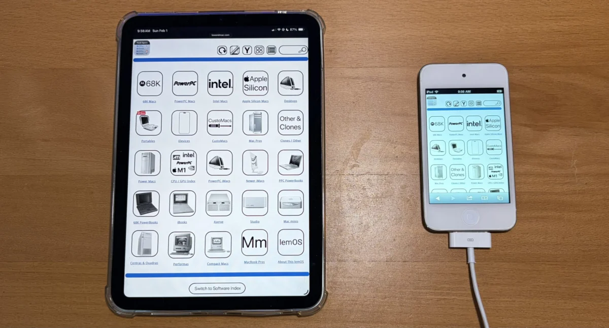
The digital landscape is in a perpetual state of evolution, with user experience at the forefront of web development priorities. In a significant move to adapt to the diverse array of devices accessing online content, Low End Mac, a long-standing resource for vintage Apple computing enthusiasts, has announced the successful completion of its first iteration of a new responsive widescreen navigation mode. This ambitious project, initially launched in February, aims to fundamentally improve how users interact with the site’s extensive archives, particularly its technical specifications and software indexes, by rendering them seamlessly across a wide spectrum of screen sizes without the need for intrusive zooming or pinching.
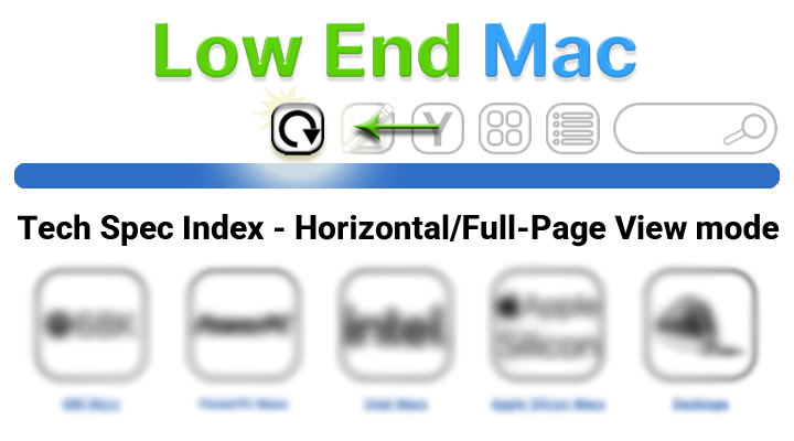
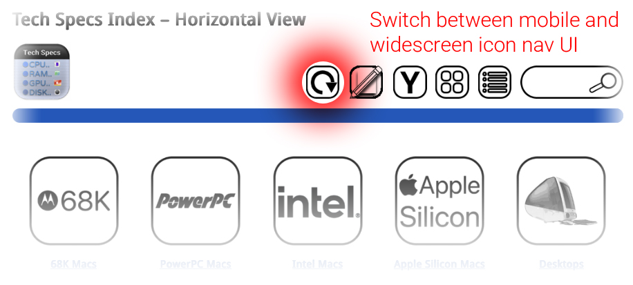
The core of this enhancement lies in a newly implemented "Horizontal View" or "Widescreen Mode." This feature is designed to present navigation pages, including the main navigation bar, detailed tech specs, and the comprehensive software index, in a fluid, expansive layout. Previously, users accessing Low End Mac on devices with smaller screens might have encountered a narrower layout, optimized for vertical scrolling and potentially requiring magnification to read detailed information. The introduction of the widescreen mode addresses this limitation directly, allowing for a more intuitive and accessible browsing experience.
Background and Development Timeline
The genesis of this project can be traced back to February of this year, when the development team at Low End Mac identified a growing need to optimize the website for modern browsing habits. As the prevalence of tablets, smartphones, and larger desktop monitors has increased, so too has the expectation for websites to adapt gracefully to these varying screen dimensions. The original, narrower icon view, while serving as a functional fallback and being better suited for devices with exceptionally narrow screens, was no longer sufficient to provide an optimal experience for the majority of users. Furthermore, this narrower view also served as a crucial fallback mechanism, allowing for the temporary restoration of the site’s sidebar if the user interface encountered any temporary anomalies.
The development process involved a phased approach, with the initial goal of completing the core navigation elements. The success of this first iteration means that a substantial portion of the site’s navigational architecture is now rendered in the new widescreen format. This includes the primary navigation bar, which serves as the gateway to different sections of the website, as well as the deeply detailed technical specifications for a vast array of vintage Apple hardware. The software index, a critical resource for users seeking to find and manage software for older Apple systems, has also been a primary focus of this upgrade.
The team has indicated that while this first iteration is complete, the rollout of the widescreen mode is not yet universal across all pages. However, a commitment has been made to extend this functionality to all applicable pages by the end of the current week. This suggests a final push to integrate the new display logic into the remaining sections of the website, ensuring a consistent and enhanced user experience across the board.
Understanding Horizontal View and Widescreen Mode
The newly introduced Horizontal View, or Widescreen Mode, represents a significant departure from the site’s previous default presentation. The original, narrower layout offered advantages in specific scenarios. For devices with inherently limited screen real estate, such as older smartphones or compact tablets, the vertical orientation of content could be more manageable, reducing the need for horizontal scrolling. Additionally, this narrower view acted as a reliable fallback. In instances where the site’s user interface might require the temporary reintroduction of a sidebar for specific functionalities or debugging, the narrower view provided a stable foundation.
However, the widescreen mode fundamentally alters the visual organization of content. Upon activation, the user interface will adopt this more expansive layout. The key benefit is the ability to display more information horizontally, reducing the cognitive load associated with navigating dense technical data. For instance, complex specification tables, which previously might have been broken up across multiple lines or required careful scrolling, can now be presented in a more coherent and readable format. This eliminates the frustrating need to "pinch to zoom," a common workaround that often disrupts the browsing flow.
The developers have emphasized that once a user switches to the widescreen viewing mode, this preference will be maintained. This persistence is a crucial aspect of the user experience, as it allows individuals to establish a browsing environment that suits their needs without needing to reconfigure settings on every visit or page load. The interface will continue to present content in this format until the user explicitly chooses to revert to the original view or selects another available display option. This level of user control is a hallmark of modern web design, empowering visitors to tailor their online interactions.
Technological Underpinnings and Implementation
While the article does not delve into the specific technical jargon, the successful implementation of a responsive widescreen mode points to the utilization of modern front-end development techniques. This likely involves:
- CSS Media Queries: These are fundamental to responsive design, allowing developers to apply different styles based on the characteristics of the viewing device, such as screen width, resolution, and orientation. The shift to widescreen mode would be triggered by media queries detecting a sufficiently wide viewport.
- Flexible Grid Systems: Frameworks like Bootstrap or custom-built grid systems would enable content to flow and reflow gracefully across different screen sizes. This ensures that elements like navigation menus, text blocks, and image galleries adapt their layout to optimize for the available horizontal space.
- Viewport Units: Using units like
vw(viewport width) andvh(viewport height) allows elements to scale relative to the browser window, contributing to a fluid and adaptive design. - Modern JavaScript Frameworks (Potentially): While not explicitly stated, JavaScript might be employed to manage the toggling of view modes, handle user preferences, and potentially dynamically adjust the layout for complex interactive elements.
The fact that the project has reached its first iteration indicates a significant investment of development resources and a commitment to modern web standards. The ability to display content "from bezel to shining bezel" implies that the layout is designed to occupy the full width of the browser window, maximizing the available screen real estate.
Supporting Data and Projected Impact
While specific user data is not provided in the original announcement, the impetus for such a change is often driven by analytics. Websites that experience a significant portion of their traffic from mobile devices or larger desktop monitors are more likely to invest in responsive design. Data from sources like Statista consistently show a global trend towards mobile-first internet access. For example, as of the first quarter of 2023, mobile devices accounted for over 57% of global website traffic. While Low End Mac may cater to a niche audience with a focus on older technology, even this demographic is increasingly accessing information through modern, multi-device ecosystems.
The implications of this enhancement are multifaceted:
- Improved Accessibility: By eliminating the need for zooming, the site becomes more accessible to users with visual impairments or those who simply prefer a more straightforward browsing experience.
- Enhanced User Engagement: A smoother and more intuitive user interface is likely to lead to longer session durations and a higher rate of page views, as users can more easily explore the wealth of information available.
- Reduced Bounce Rates: Frustration with clunky interfaces is a common reason for users to abandon a website. The widescreen mode aims to mitigate this by providing a more polished and user-friendly experience.
- Future-Proofing: As web technologies continue to evolve, adopting responsive design principles ensures that Low End Mac remains relevant and accessible in the years to come.
Potential Reactions and Future Outlook
While no direct statements from users or related parties are included, the announcement is likely to be met with positive reception from the Low End Mac community. This community, deeply invested in the history and functionality of vintage Apple hardware and software, values detailed and accurate information. The ability to access this information more readily, particularly on modern devices, would be a welcome improvement.
One might infer that long-time contributors and administrators of the site would see this as a vital step in maintaining the relevance and usability of their extensive archive. The effort involved in curating and presenting such a wealth of historical data is considerable, and ensuring its accessibility is paramount to its continued value.
Looking ahead, the successful completion of this first iteration sets a strong precedent for future development. As the team continues to refine the widescreen mode and roll it out across all pages, further enhancements could include:
- Interactive Elements: Exploring how complex technical diagrams or software interfaces can be presented interactively within the widescreen layout.
- Thematic Adjustments: Potentially offering different visual themes or layout options that cater to specific types of content within the widescreen mode.
- Performance Optimizations: Continuously working to ensure that the responsive design does not negatively impact page load times, a crucial factor for user satisfaction.
The commitment to completing the rollout by the end of the week underscores the team’s dedication to a swift and comprehensive implementation. The project, initiated with the goal of improving user experience, is a testament to Low End Mac’s ongoing effort to serve its dedicated community in an ever-changing digital world. This move towards a more fluid and adaptive interface signifies a forward-thinking approach, ensuring that valuable historical computing knowledge remains accessible and engaging for generations of enthusiasts.