 Vera Clarissa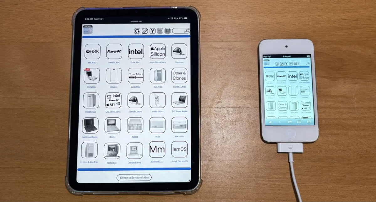
Low End Mac, a prominent online resource for vintage and enthusiast Apple hardware, has announced the successful completion of the first iteration of a major website overhaul aimed at significantly improving user experience, particularly for those accessing the site on modern, wider displays. The project, which commenced in February, has culminated in a new "widescreen mode" that allows nearly all navigation pages, including the navigation bar, technical specifications, and software index, to be displayed in their entirety without the need for pinching and zooming. This marks a substantial step forward in making the wealth of information on Low End Mac more accessible and user-friendly across a diverse range of devices.
The Evolution of Digital Content Consumption and the Need for Adaptation
The digital landscape has undergone a profound transformation over the past two decades. As screen resolutions have dramatically increased and aspect ratios have widened, websites designed in an era of narrower displays have often struggled to keep pace. The proliferation of high-definition monitors, larger laptop screens, and the ubiquitous presence of widescreen smartphones and tablets has created a new standard for content presentation. Users now expect information to flow seamlessly across their screens, consuming content without the frustrating need to constantly pan and zoom.
Low End Mac, with its deep archive of information on Apple products dating back to the early days of personal computing, has been a vital repository for enthusiasts, collectors, and researchers. However, as the platform aged, its original design, optimized for a different era of web browsing, began to present challenges. The successful implementation of this new widescreen mode directly addresses these growing accessibility concerns, ensuring that the valuable historical data remains readily available and easily digestible for a contemporary audience.
A Phased Approach to Modernization: From Conception to Implementation
The journey to this significant update began in February of this year, with the initial intention to complete the project within the same month. However, the complexities inherent in redesigning a vast, content-rich website often necessitate a more extended development cycle. The team at Low End Mac has evidently taken a meticulous approach, ensuring that the new functionality is robust and addresses the core usability issues.
The core of this redesign is the introduction of a "Horizontal View" or "Widescreen Mode." This mode fundamentally alters how navigation pages are presented. Instead of a more compact layout that might have been suitable for older, narrower screens or as a fallback mechanism, the widescreen mode expands content to fill the available horizontal space. This means that elements like the primary navigation bar, detailed technical specifications for various Mac models, and the comprehensive software index are now displayed in a more expansive, organized fashion. The goal is to present information "from bezel to shining bezel," a colloquialism that emphasizes the complete and uninterrupted display of content across the entire screen width.
Understanding the Widescreen Mode and its Antecedents
The introduction of widescreen viewing is not an abandonment of previous design principles but rather an enhancement that acknowledges evolving user habits and device capabilities. The original, narrower icon view, which may have been more akin to a traditional sidebar and content area layout, served a critical purpose. It offered optimized viewing for devices with narrower screens, such as older smartphones or tablets, ensuring a manageable user experience. Furthermore, this narrower layout likely served as a functional fallback, allowing for the temporary restoration of a sidebar if the site’s user interface required it for specific functionalities or troubleshooting.
The new widescreen mode is designed to be persistent. Once a user opts to switch to this viewing mode, the website’s interface will retain this setting. This "sticky" behavior is a common and appreciated feature in modern web design, as it reduces the cognitive load on the user, who no longer needs to reapply their preferred settings repeatedly. The persistence ensures a consistent and predictable browsing experience, allowing users to delve deeper into the site’s content without interruption.
It is important to note that the implementation of this widescreen feature is an ongoing process. While the core navigation and informational pages have been successfully updated in this first iteration, the developers have indicated that not all pages on the site currently support this enhanced viewing mode. However, a commitment has been made to complete the rollout across the entire website by the end of the current week. This phased approach allows for thorough testing and refinement, ensuring that the final product meets the high standards expected by the Low End Mac community.
Technical Considerations and User Interface Enhancements
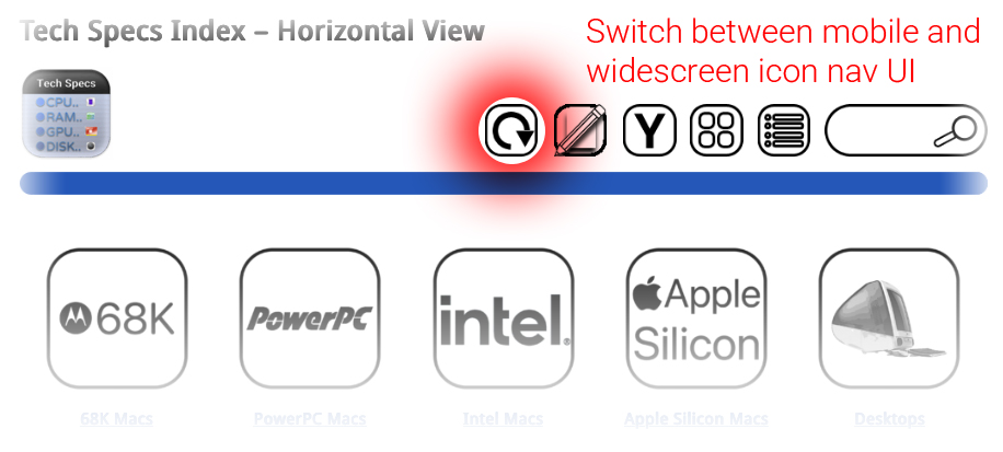
The visual cues provided in the accompanying images offer a glimpse into the intended user interface of the redesigned website. The first image, showing a "viewmode_button.jpg," suggests an intuitive toggle mechanism for users to switch between viewing modes. This explicit control empowers users to select the layout that best suits their current device and personal preference.
The second image, featuring a scaled-down representation of "IMG_1380-scaled.jpeg," illustrates how the user interface can be envisioned for improved usability across multiple device sizes. While the specific details of the UI are not fully elaborated in the provided text, the implication is a more responsive and adaptable design. This suggests that the website’s layout will intelligently adjust to different screen dimensions, maximizing the utility of the widescreen mode on larger displays while potentially offering a streamlined, yet still accessible, experience on smaller screens. This could involve elements like collapsible menus, adaptive text sizing, and optimized image scaling.
The underlying technology enabling this transformation likely involves modern front-end development techniques such as CSS Flexbox or Grid, alongside responsive design principles. These technologies allow developers to create fluid layouts that adapt seamlessly to various screen sizes and orientations. The emphasis on "bezel to shining bezel" suggests a commitment to a full-bleed or near-full-bleed content presentation, minimizing extraneous white space and maximizing the screen real estate dedicated to the information itself.
Background Context: The Enduring Appeal of Low End Mac
Low End Mac has carved a significant niche in the online world by focusing on a segment of Apple’s product history that often gets overlooked by mainstream technology sites. For many, Macs from the 1980s, 1990s, and early 2000s represent a period of significant innovation and user-friendly design. These machines, while technologically dated by today’s standards, hold a special place in the hearts of enthusiasts who appreciate their build quality, unique operating system interfaces, and the historical context they provide.
The site serves as a vital resource for:
- Collectors: Providing detailed specifications, identifying model variations, and offering guidance on restoration and maintenance.
- Retrocomputing Enthusiasts: Offering software archives, driver downloads, and community forums for keeping vintage systems operational.
- Educators and Historians: Serving as a comprehensive archive of Apple’s technological evolution and product strategy.
- Users Seeking Affordable Solutions: Many users still rely on older Macs for specific tasks due to their low cost and robust nature.
The commitment to improving the website’s accessibility directly supports these diverse user groups, ensuring that the rich historical data remains a living and usable resource.
Broader Implications and Future Outlook
The successful implementation of this widescreen mode at Low End Mac has several broader implications for similar niche archival websites and content-heavy platforms:
- Setting a Precedent for Accessibility: This redesign demonstrates a proactive approach to ensuring digital content remains accessible in an ever-evolving technological landscape. It highlights the importance of adapting to modern screen standards, even for historical archives.
- Enhancing User Engagement: A more user-friendly interface directly translates to increased engagement. When users can easily access and consume information, they are more likely to spend more time on the site, explore more content, and engage with the community.
- Future-Proofing Content: By adopting modern web design principles, Low End Mac is better positioned to remain relevant and functional for years to come, even as display technologies continue to advance.
- Community Appreciation: The Low End Mac community, composed of dedicated enthusiasts, is likely to highly appreciate this significant upgrade. Their passion for vintage Apple technology is mirrored by the site’s commitment to preserving and presenting that history in the most accessible way possible.
While the immediate focus is on completing the rollout of the widescreen mode, the long-term implications suggest a continued commitment to user experience and content modernization at Low End Mac. As the site continues to serve as a cornerstone for vintage Apple enthusiasts, these ongoing improvements will undoubtedly solidify its position as an indispensable resource for years to come. The project’s successful first iteration is a testament to the dedication of the Low End Mac team in ensuring that the legacy of Apple’s past remains vibrant and accessible for the digital present and future.