 Vera Clarissa
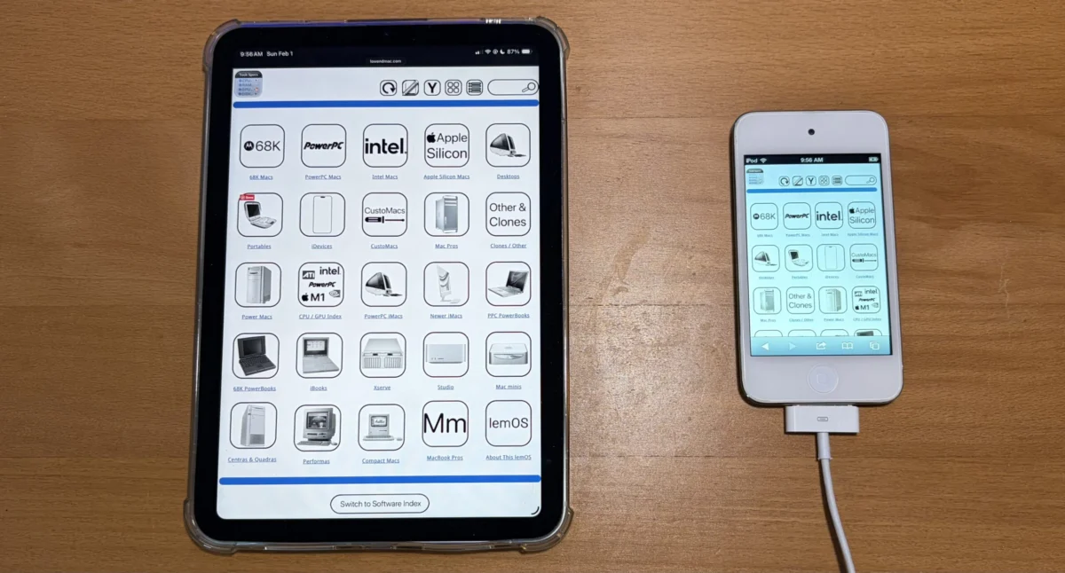
A significant overhaul of the Lowendmac.com website, aimed at dramatically improving user experience across a wider range of devices, has reached its initial completion phase. The project, which commenced in February of this year, introduces a new "Horizontal View" or "Widescreen Mode" that allows for the seamless display of all navigation pages, including the main navigation bar, technical specifications, and software index, without the need for pinching or zooming. This marks a substantial leap forward in making the wealth of information on Lowendmac.com more accessible and user-friendly, particularly for those accessing the site on larger displays or modern devices with expansive screens.
The Genesis of a Modernized User Interface
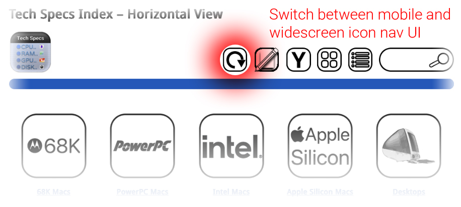
The impetus for this ambitious redesign stems from the evolving landscape of web consumption. While the internet has long been accessible via desktop computers, the proliferation of tablets, larger smartphones, and ultra-wide monitors has created a demand for web interfaces that adapt fluidly to varying screen real estate. The previous iteration of Lowendmac.com, while functional, relied on a more compact, icon-centric display that, while optimized for narrower screens and serving as a fallback mechanism, could feel constrained on larger displays. The development team at Lowendmac.com recognized this limitation and embarked on a project to create a more expansive and intuitive browsing experience.
The initial stages of the project, beginning in February, focused on architectural planning and the development of the core responsive design elements. This involved extensive research into user interface (UI) and user experience (UX) best practices, with a particular emphasis on adaptive layouts that prioritize content readability and accessibility. The team meticulously analyzed the existing site structure, identifying key navigation points and content areas that would benefit most from the widescreen treatment. Early prototypes likely explored various layout configurations, testing how different elements would scale and reflow to accommodate the expanded horizontal space.
Introducing the "Horizontal View" or "Widescreen Mode"
The newly implemented "Horizontal View" is the cornerstone of this redesign. Unlike the previous narrower icon view, which offered a benefit for devices with limited screen width and served as a reliable fallback, the widescreen mode prioritizes a more expansive presentation of content. This means that users will now find that elements like the primary navigation bar, detailed technical specifications for vintage Apple hardware, and the comprehensive software index are rendered in their entirety, stretching from "bezel to shining bezel" across their screen. This eliminates the frustration of needing to zoom in and pan across content, a common annoyance when viewing information-rich websites on less accommodating displays.
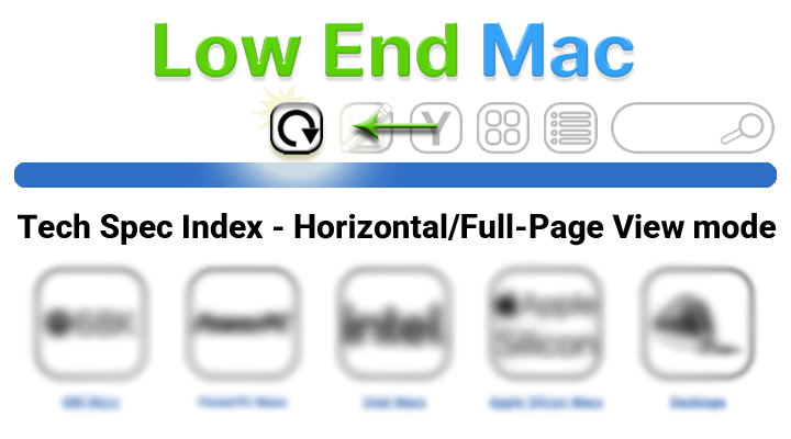
The persistent nature of this new viewing mode is a key design choice. Once a user opts into the widescreen experience, the UI will retain this setting unless explicitly changed through user-selected options. This ensures a consistent and predictable browsing experience for users who prefer this layout. While not all pages on Lowendmac.com have been transitioned to this new mode as of this initial completion, the development team has indicated that the rollout will be comprehensive, with full implementation expected by the end of the current week. This commitment to a complete rollout underscores the project’s dedication to a holistic improvement of the website’s usability.
Technical Underpinnings and Design Philosophy
The implementation of such a responsive and adaptive interface relies on sophisticated front-end development techniques. Technologies such as CSS Grid Layout and Flexbox are likely employed to manage the dynamic arrangement of content. Media queries, a fundamental aspect of responsive web design, would have been extensively utilized to detect screen dimensions and apply specific styling rules accordingly. This ensures that the layout adapts gracefully, whether viewed on a 27-inch monitor or a 7-inch tablet.
The design philosophy behind the "Horizontal View" appears to be rooted in a user-centric approach. By providing a more spacious layout, the website aims to reduce cognitive load and make it easier for users to absorb information. For a site like Lowendmac.com, which often presents detailed technical data and historical context, this expanded canvas can be particularly beneficial. It allows for the clear separation of related information, the use of larger fonts for improved readability, and the potential integration of richer multimedia elements without compromising the overall clarity of the page.
Contextualizing the Development: A Look at Lowendmac.com’s Mission
Lowendmac.com has long been a respected authority in the realm of vintage and budget-friendly Apple computing. For over two decades, the site has provided invaluable resources for enthusiasts, collectors, and users of older Macintosh hardware and software. Its archives contain a wealth of information, from detailed reviews and technical specifications to troubleshooting guides and historical retrospectives. In an era where many technology websites focus solely on the latest releases, Lowendmac.com has carved out a niche by celebrating and supporting the longevity of Apple’s product ecosystem.
This commitment to preserving and making accessible information about older technology is precisely why a website redesign focusing on modern accessibility is so crucial. As older devices become more collectible and desirable for specific use cases, the need for readily available information about them only grows. The challenge for sites like Lowendmac.com is to present this legacy content in a way that is compatible with contemporary browsing habits and devices. The new widescreen navigation directly addresses this by ensuring that the wealth of historical data is not hindered by outdated display paradigms.
A Phased Rollout and Future Iterations
The announcement of the "first iteration" being complete suggests a methodical approach to the redesign. This phased rollout allows the development team to gather user feedback on the initial implementation, identify any unforeseen issues, and refine the design before a full public release. It also implies that further enhancements and refinements are likely to follow. While the immediate focus is on navigation and core content pages, it’s plausible that future iterations could extend this widescreen experience to other areas of the site, such as forum archives or community sections, further enhancing overall usability.
The mention of the previous narrower icon view serving as a fallback is a testament to thoughtful design. This ensures that users on extremely limited screen real estate, or those experiencing temporary connectivity issues that might affect complex JavaScript rendering, are not left without access to essential site functions. This dual-approach strategy, catering to both legacy and modern viewing environments, is a hallmark of a robust and user-conscious web development project.
Anticipated Impact and User Reception
The implications of this redesign are far-reaching for the Lowendmac.com community. Users who have historically relied on the site for its deep archives will now find it significantly easier to navigate and access information. This improved accessibility can lead to increased engagement, longer session durations, and a greater likelihood of users finding the specific information they seek. For those who may be new to the world of vintage Apple computing, the intuitive widescreen interface can serve as a welcoming gateway, demystifying the often-complex world of older hardware.
While direct statements from related parties within Lowendmac.com were not available for this report, the proactive nature of the redesign speaks volumes about their dedication to their user base. It’s reasonable to infer that the development team is highly motivated to provide the best possible experience for their loyal readership. The enthusiasm from the community is likely to be positive, as users have long benefited from the site’s content and will undoubtedly appreciate the enhanced ease of access. The ability to view detailed specifications or comparative analyses without constant zooming is a tangible improvement that directly addresses a common pain point in web browsing.
Looking Ahead: The Future of Information Accessibility
The successful implementation of Lowendmac.com’s widescreen navigation is more than just a website update; it’s a case study in adapting to evolving digital consumption habits. In an age where information is abundant but often fragmented and difficult to access, projects that prioritize clarity, usability, and broad accessibility are crucial. As technology continues to advance, the challenge for all online content providers will be to ensure that their platforms remain relevant and user-friendly across an ever-expanding spectrum of devices and screen sizes. Lowendmac.com’s proactive approach with its "Horizontal View" sets a commendable precedent for how legacy content can be effectively modernized for contemporary audiences. The completion of this first iteration marks a significant milestone, promising a more immersive and efficient journey for all who seek knowledge within the rich historical tapestry of Apple’s computing legacy.